
Project Overview
The goal of this project was to analyze the contents of women's handbags, find patterns in them, and use data visualization to weave the insights into a story.
Data from sources like magazines, blogs, and fashion websites, including British Vogue and Refinery29, along with independent YouTube channels, informed the analysis of 125 handbags. Key focus areas included common items, time spent searching, unusual finds, item values, bag weight, and its impact on women's health.
THE TEAM
Sayee Ambekar
Art Director
Shivani Bhagwat
Research Lead
Aparna Badgandi
Creative Strategist
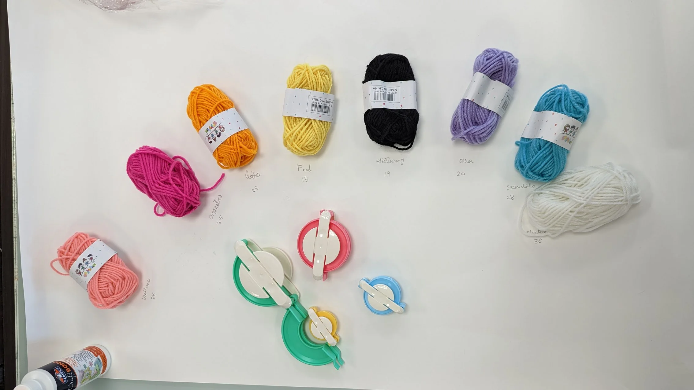
Based on our preliminary understanding and assumptions of the expected dataset, we set up a spreadsheet with columns to accommodate the different categories of items - cosmetics, stationery, food, wellness, essentials, electronics, clothes & accessories, and other. While watching the What's in my Bag videos, the items found in each bag were sorted into these categories. The categories in the dataset were later color coded which was useful while creating the data visualization.
View the dataset here

Using a combination of automated and manual processes, we counted the total number of items under each category, the number of occurrences of each item under each category. We were also able identify the highest items in each category. This helped in deciding the proportion of each category in the data visualization. The most found items were also identified in this process.


The Branding
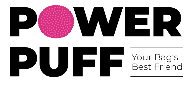
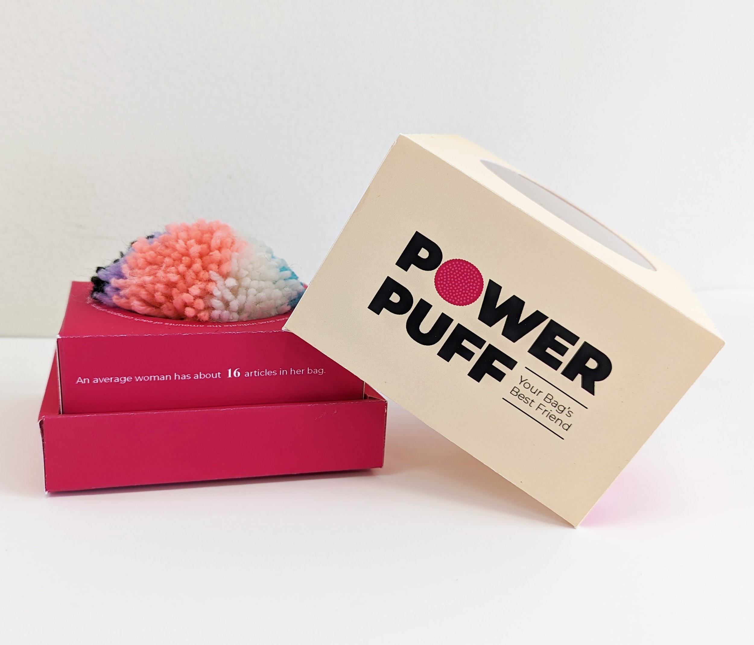
We came up with the name Powerpuff because the history of bags taught us that bags are a symbol of power and independence for women.
The logo is bold yet fun and feminine, perfect for the product and target audience.

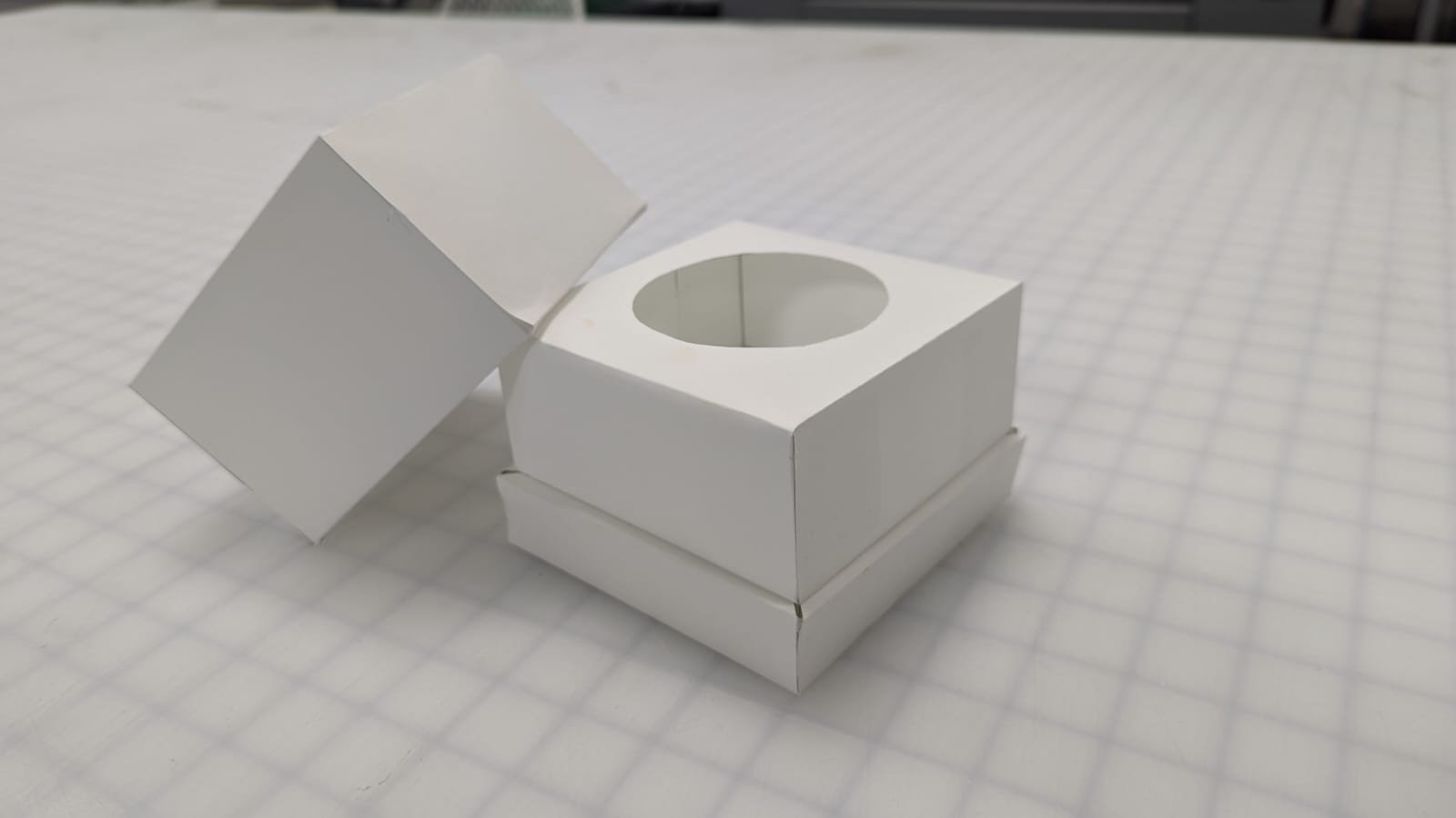
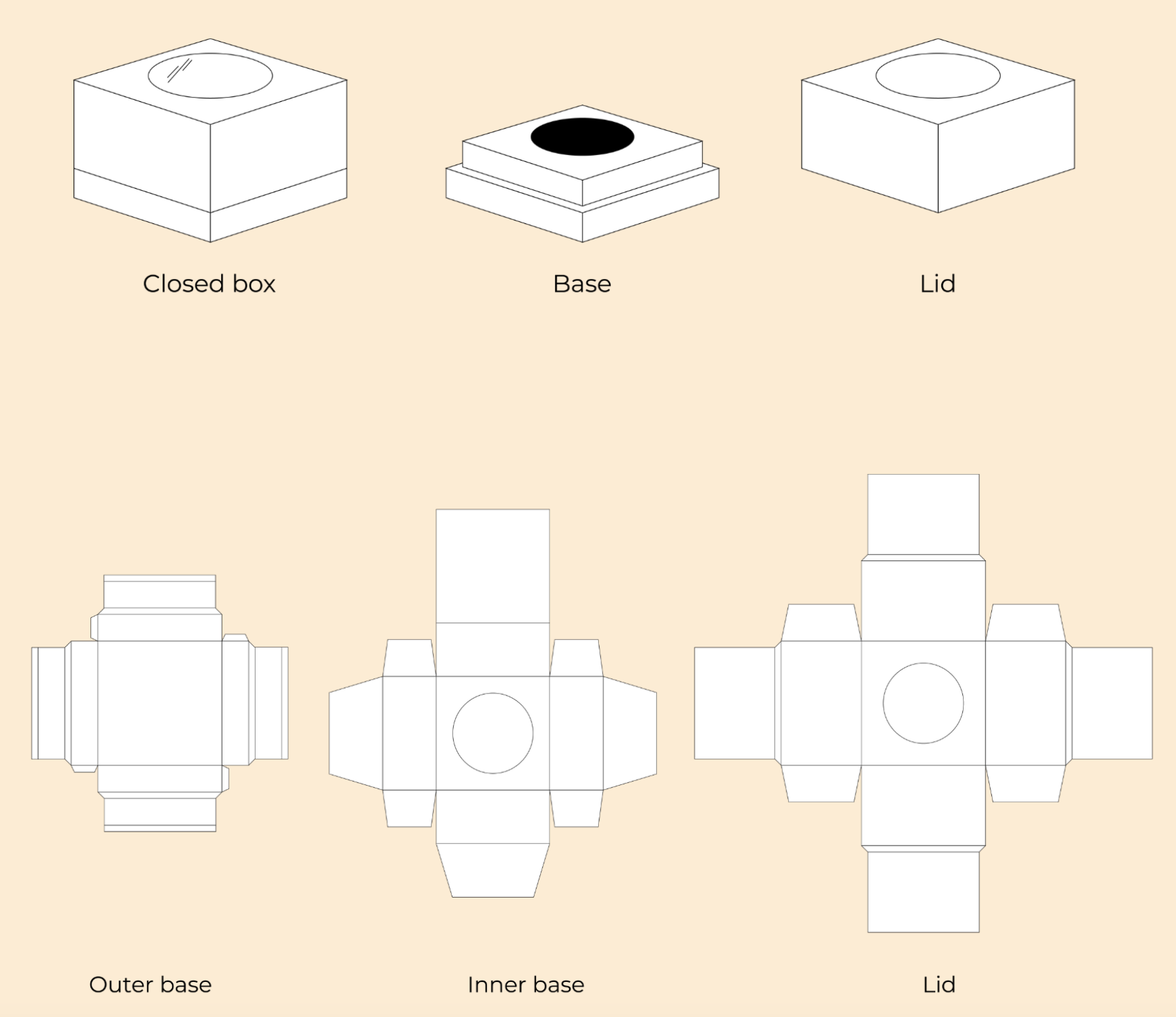
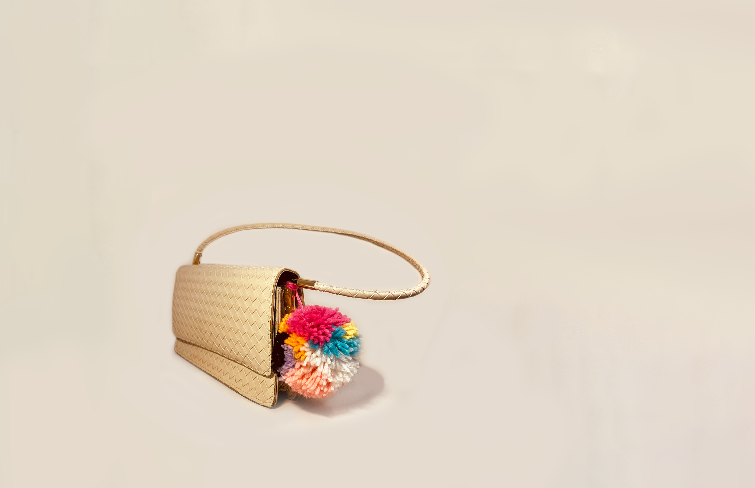
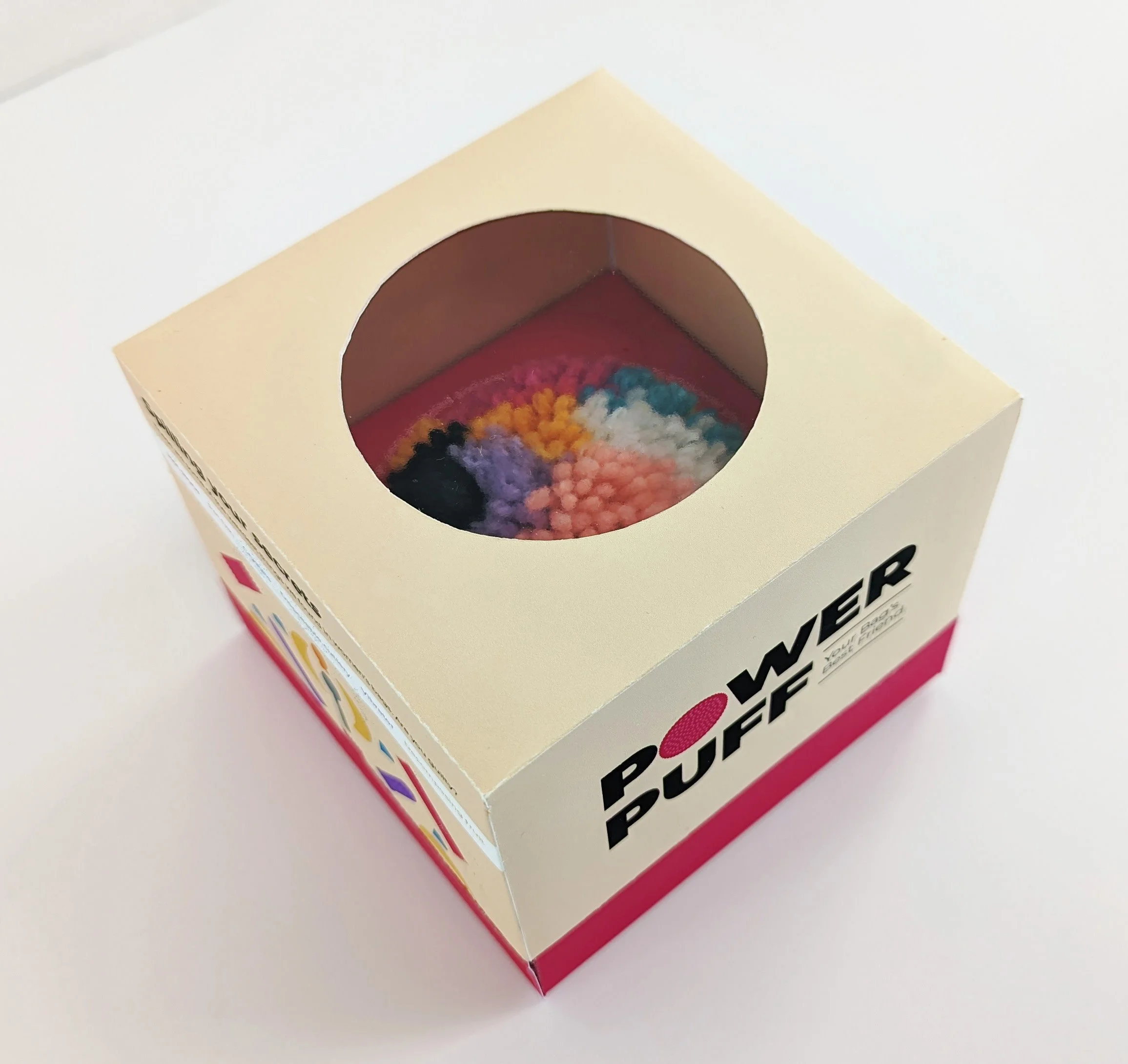
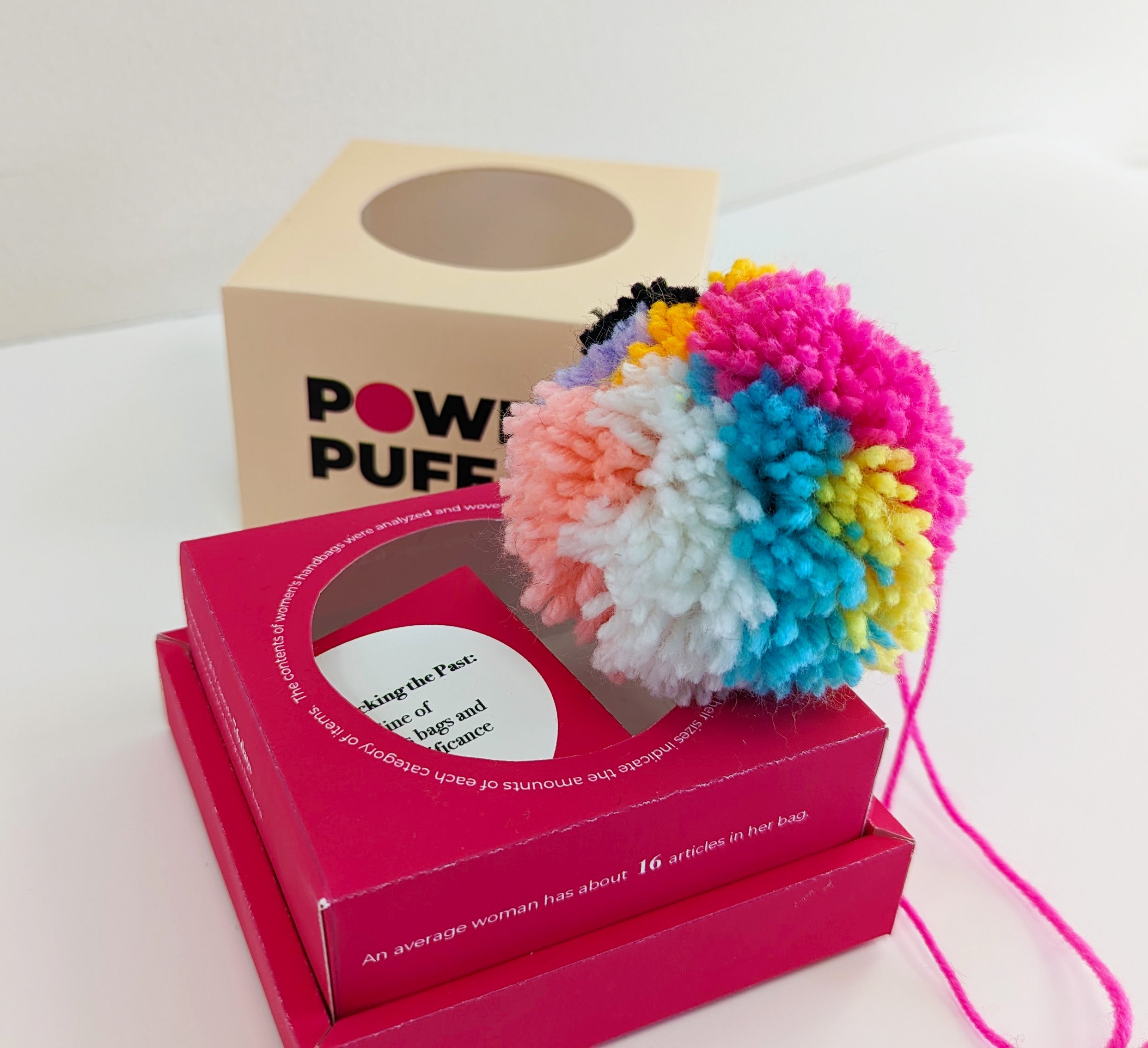
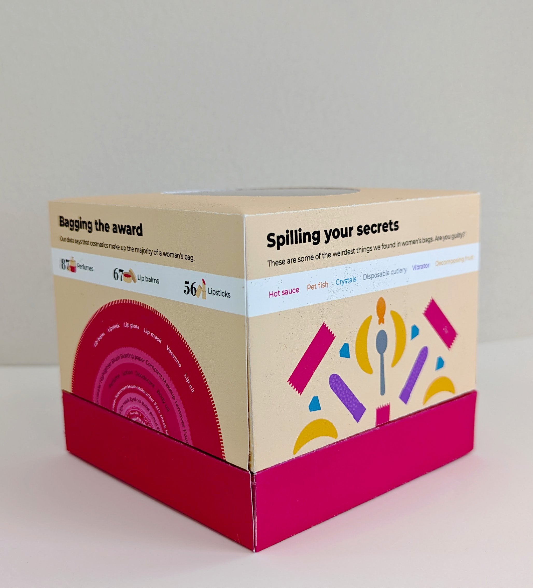
We transformed the analysis of women's handbag contents into a fluffy pompom, serving as a visual representation of the data. Colors and sizes of the pompom segments signify the relative amounts of different item categories. The packaging acts as a key to interpret the data visualization and provides additional information on the focus areas related to the topic.

The Data Visualization
The Key to understand the pompom data visualization is printed on the pompom's packaging.
Each side along with the inner surfaces hold information related to items found in a woman's bag.


Want to see more packaging design projects?
Do check out this project

Wildlife Rescue Kit
Packaging Design | Book Design