My love-hate relationship with sleep...
I have always been a light sleeper. I love to sleep and I look forward to sleeping at night because I get transported to a beautiful dreamland. But falling asleep and staying asleep is not easy for me. Even the slightest noise or the faintest light can wake me up.
I collected my sleep data for 50 days and analyzed the stressors, internal and external factors that affected my sleep. Through this project, I hope to analyze what worked and what did not work for me while falling asleep and also for staying asleep.
View the complete data Set here!
The Data Visualization
I thought that for this Data Visualization, stars would be the most apt way of plotting my sleep data. As a child, I had glow-in-the-dark star stickers on my bedroom ceiling. I counted the stars and traced imaginary patterns in them when I was unable to fall asleep. So, I decided to bring this fond childhood memory when life was easy and I was able to fall asleep just by counting those stars.
The main data visualization that consists of 50 nights sleep plotted on a temporal data structure. The concentric circles represent the number of hours of sleep received and the radial lines represent the days when the data was collected.
AT A GLANCE VIEW


COMPARISON VIEW


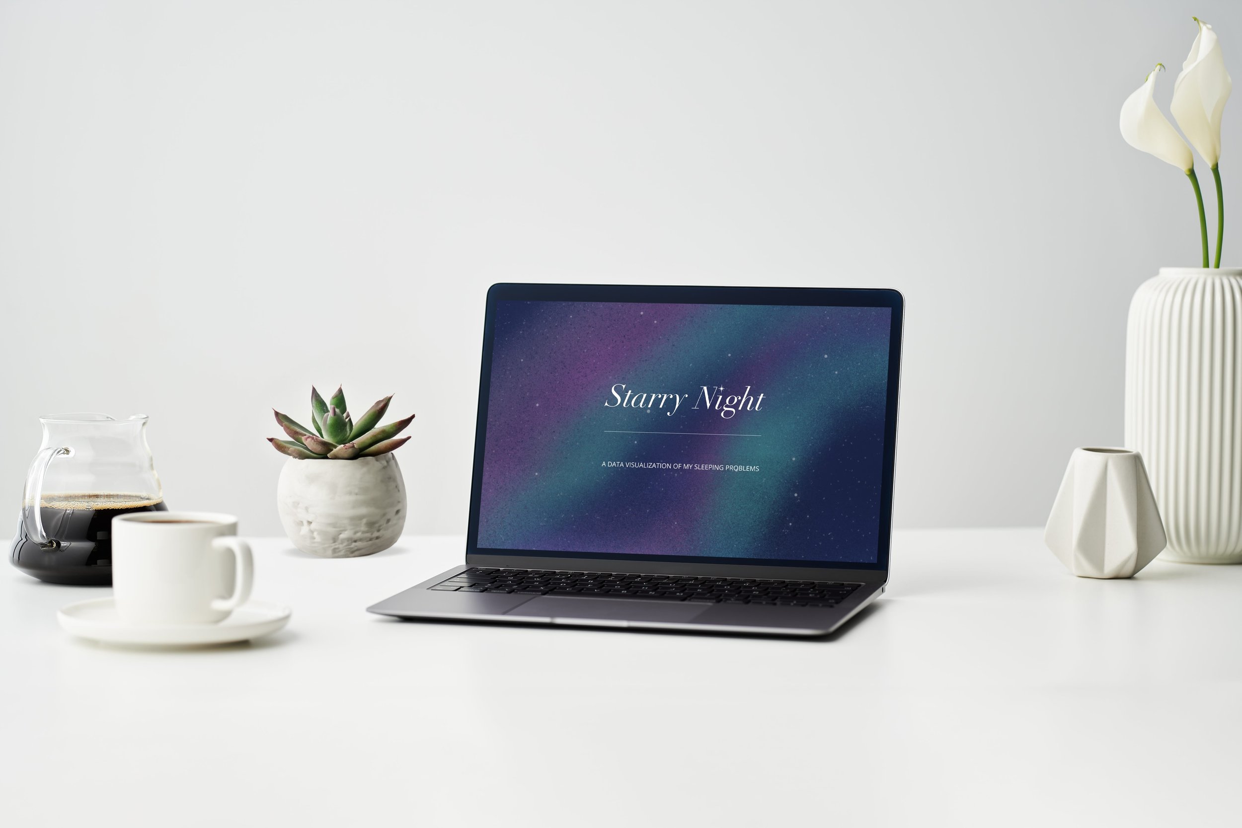
The Interactive Website

An automatically scrolling landing page reveals the purpose and goal of the data visualization and ultimately leads to the main infographic.
There are two views of the infographic. One is the ‘AT A GLANCE’ view which is the default view. The second is the ‘COMPARISON’ view that lets viewers compare every night's sleep in relation to each other.
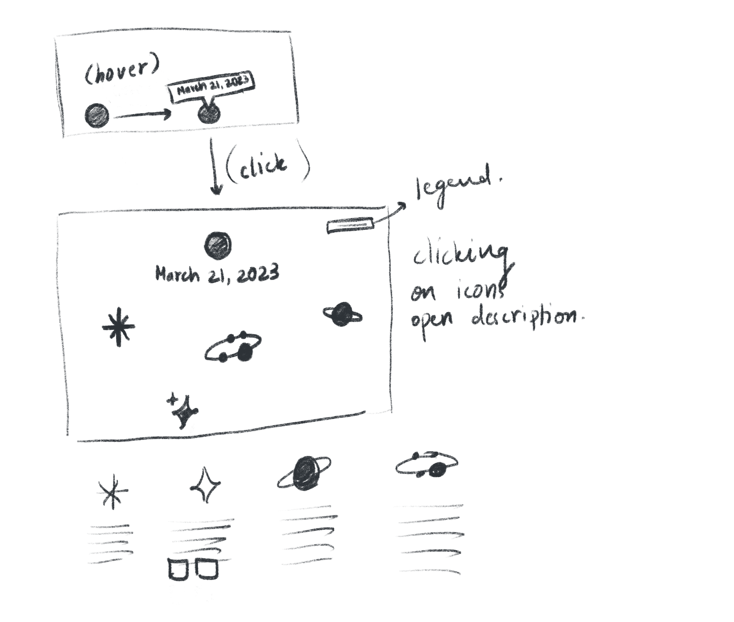
Hovering over any star reveals the date when the sleep was recorded.
Each star is clickable and reveals the sleep data of the corresponding day. Aspects like amount of sleep, quality of sleep, reason for the quality of sleep, feelings after waking up the next day, and random thoughts recorded while falling asleep that are all a part of the sleep data set are shown on the screen using different icons.
Both the at a glance view and the comparison view have a 'SORT BY HOURS' section that lets the viewer see the days when I got the selected hours of sleep. Additionally there is another sorting feature that lets viewers sort the days as per weekends and weekdays.
The Design Language
A modified version of Didot Italic has been used for the Identity. The dot on the letter i has been modified to look like a star to match the name.

Iconography
The challenges I was able to overcome
The biggest challenge was to plot the data in a meaningful way that is easy to understand and relates to the concept. Since I had decided to go with stars as my concept, I first explored creating a data visualization using the shapes of real constellations. This idea was scraped because the groupings in each constellation did not make any sense. The second idea was of plotting the data in a circular temporal data structure.
Here are some sketches that I did during the ideation process.


Interested in data visualization projects?
Do check out this project

Power Puff
A tactile data visualization